Analysing Print Adverts
What makes an EFFECTIVE print ad?
.Clear and effective image
.Memorable - Emotional, informative
.Slogan/catch phrase/ tagline - entice audience, stick in head
.Use of persuiasive language
.Clear language - to the point
.Appropriate font - typeface, sans-serif/serif
.Colour scheme - ideally 3/4
.Clear layout
.Name of the product
.Website
.Brand identity - Logo name of brand / company
.Eye catching
Red bull print ad:
Adaptation of red bull 'gives you wings' slogan
Language is persuasive = Uses second person and imperative to directly approach you!
Typeface is san serif
Name of the product is repeated three times
Clear and effective use of the wide angle to demonstrate the precipitous height they are at.
Colour scheme - uses blue, red, yellow, and white
layout is uncluttered, clear
Coca Cola print ad
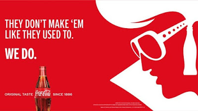
. Immediatley can see that the typeface being used is a sans-serif font
. Language is persuasive within this. Saying others done make colas like coca- cola does.
. Use of second person and imperative to persuade people that coca cola is reliable....'we do'
. Simple colour scheme, red white follows the coca cola logo and colour scheme completely
. Simple and clear layout to create an easy to read ad
. Use of elvis as reference to the slogan being presented 'they don't make 'em like they used to' showing that coca cola is like elvis in that sense
. The 'Origional taste' showing origionality and comfort as a bevarage that wont change.
Pepsi Print ad

. Usage of persuasive language to convince the reader to have pepsi as it will be like being in the UEFA Champion league arena.
. Background connotes with the colour scheme, red black and blue
. Usage of a high visual image of pepsi with water on the can to make it look visually appealing.
. The top of the cap of the can is used as visual art to be shown as the UEFA arena
. Typeface within this is sans-serif
. Clean and simple logo
. Light glimmer directly around the can as that is the shine of the arena glowing outwards.
Fanta Print ads

. Sans-serif typeface
. Clean and simple
. Colour scheme is orange and white and fits the background colour scheme as well
. The language that is being used within this print advert is persuasive and makes the reader want to try fanta. ' Do we have to say more?'
. The usage of making the can like an orange shows the nature of the drink as its literally from fruit to can


Hi Jamie,
ReplyDeleteThese are great, well done!
Mr H
Hi Jamie, just noticed you haven't included the list of what makes a print ad effective, so please just include that.
DeleteHey sir i think ive added it and made the appropriate changes.
Delete